
Matplotlib20本ノック
5,タイトルとラベル
グラフの詳細設定について演習を行っていきます。
Matplotlibの公式ドキュメントにあるグラフ設定できる機能を順に試していきます。
まずは、問題1.で作成したグラフにタイトル Result をつけてください。
また、x軸にはx axis, y軸にはy axisというラベルもつけてください。
x = np.arange(10)
y = np.random.randint(-10,10,10)
plt.plot(x,y)
plt.title()でタイトルが付けられます。
plt.xlabel() でx軸のラベルを付けることができます。
plt.ylabel() でy軸にラベルを付けることができます。
import matplotlib.pyplot as plt
import numpy as np

%matplotlib inLine

x = np.arange(10)
y = np.random.randint(-10,10,10)
plt.plot(x,y)
plt.title('Result')
plt.xlabel('x axis')
plt.ylabel('y axis')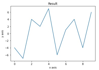
5,軸範囲
グラフの軸範囲を指定します。先ほど問題2で作成した散布図を使います。
こちらのグラフのx軸の範囲を0~40とし、y軸の範囲を0~120としてください。
x1 = np.random.randint(10,20,20)
x2 = np.random.randint(20,30,20)
y1 = np.random.randint(50,100,20)
y2 = np.random.randint(0,40,20)
plt.scatter(x1,y1)
plt.scatter(x2,y2)
まずはなにも範囲を指定していない散布図を表示します。
x1 = np.random.randint(10,20,20)
x2 = np.random.randint(20,30,20)
y1 = np.random.randint(50,100,20)
y2 = np.random.randint(0,40,20)

plt.scatter(x1,y1)
plt.scatter(x2,y2)

<matplotlib.collections.PathCollection at 0x286a65dac10>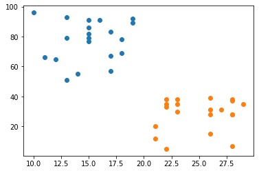
これに対して、x軸 y軸に範囲を指定して出力します。
plt.xlim() x軸の範囲を指定
plt.ylim() y軸の範囲を指定
plt.scatter(x1,y1)
plt.scatter(x2,y2)
plt.xlim(0,40)
plt.ylim(0,120)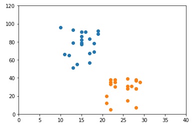


コメント