
Matplotlib20本ノック
9,マーカの種類・サイズ変更
以下の散布図のマーカの種類とサイズを変更してみてください。
・マーカ:星, サイズ:80
・マーカ:三角形, サイズ:60
・マーカ:x, サイズ:30
x1 = np.random.randint(10,35,20)
x2 = np.random.randint(5,45,20)
x3 = np.random.randint(0,40,20)
y1 = np.random.randint(50,100,20)
y2 = np.random.randint(0,40,20)
y3 = np.random.randint(20,80,20)
plt.scatter(x1,y1)
plt.scatter(x2,y2)
plt.scatter(x3,y3)
とりあえず問題の通りグラフを出力します。
x1 = np.random.randint(10,35,20)
x2 = np.random.randint(5,45,20)
x3 = np.random.randint(0,40,20)
y1 = np.random.randint(50,100,20)
y2 = np.random.randint(0,40,20)
y3 = np.random.randint(20,80,20)

plt.scatter(x1,y1)
plt.scatter(x2,y2)
plt.scatter(x3,y3)
<matplotlib.collections.PathCollection at 0x12d6752d700>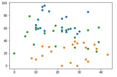
このままでも色分けされているので、問題はないのですが、
より見やすくするように、マーカーという機能があります。
marker=' ' マーカーの形状を設定
s= サイズを指定
plt.scatter(x1,y1, marker='*', s=80)
plt.scatter(x2,y2, marker='^', s=60)
plt.scatter(x3,y3, marker='x', s=30)
<matplotlib.collections.PathCollection at 0x12d67633160>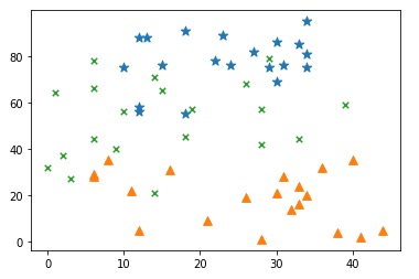
10,注釈
以下のコードで作成したグラフに注釈を加えましょう。
最小値となる部分に対して矢印を使ってmin valueというテキストを表示してください。
data=[5,3,4,2,0,3,2,1,4,6,8,5]
plt.plot(data)
まずはグラフを表示してみます。
data=[5,3,4,2,0,3,2,1,4,6,8,5]
plt.plot(data)
[<matplotlib.lines.Line2D at 0x12d67685550>]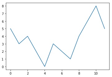
一番最小となるのは 4,0の部分です。ここに矢印をつけるメソッドが
plt.annotate() 矢印をつける
です。
data=[5,3,4,2,0,3,2,1,4,6,8,5]
plt.plot(data)
plt.annotate('min value',xy=(4.2,0),xytext=(9,1),arrowprops=dict(facecolor='red', shrink=0.05))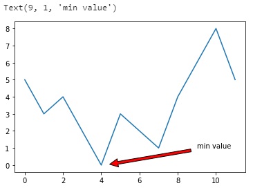
shrinkとは0~1の値を入れます。1が一番長く縮小率を入れていきます。
0.05だとデキストから程よく離れた長さにできます。
0.5とすると長さは半分になります。


コメント