
Matplotlib20本ノック
1,基本的なグラフの作成(折れ線グラフ)
以下のコードで作成した変数xとyを用いて折れ線グラフを出力してください。
x = np.arange(10)
y = np.random.randint(-10,10,10)
まずは必要なモジュールをimportします。
数値計算をするNumpy
データを可視化する為のmatplotlib
jupyter notebook上にグラフを表示させてために
インライン表示をONにします。
import matplotlib.pyplot as plt
import numpy as np

%matplotlib inLine
importが完了したら、問題文の数値を定義します。
x = np.arange(10)
y = np.random.randint(-10,10,10)
あとはmatplotlibのモジュールをつかい
x,yの値を引数に入れて実行します。
plt.plot(x,y)
[<matplotlib.lines.Line2D at 0x110f9438850>]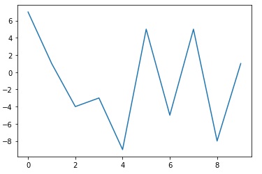
ちなみにx軸がデータのindex番号でも問題がなければ
plt.plot(y)でもグラフを表示させることができます。
2,基本的なグラフの作成(散布図)
以下のコードで作成した変数x1,x2 とy1,y2を用いて散布図を出力してください。
x1 = np.random.randint(10,20,20)
x2 = np.random.randint(20,30,20)
y1 = np.random.randint(50,100,20)
y2 = np.random.randint(0,40,20)
散布図は plt.scatter() で作成できます。
x1 = np.random.randint(10,20,20)
x2 = np.random.randint(20,30,20)
y1 = np.random.randint(50,100,20)
y2 = np.random.randint(0,40,20)

plt.scatter(x1,y1)
plt.scatter(x2,y2)
<matplotlib.collections.PathCollection at 0x110f95489a0>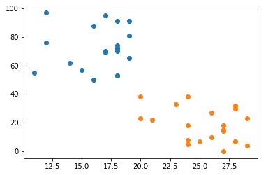


コメント